Task / goal
Refresh of the Vinea product portfolio design.
Creative solution
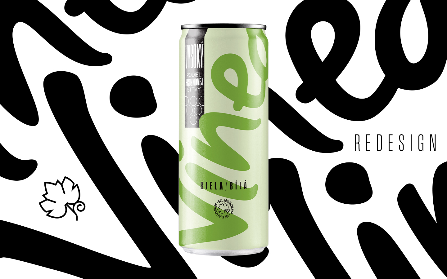
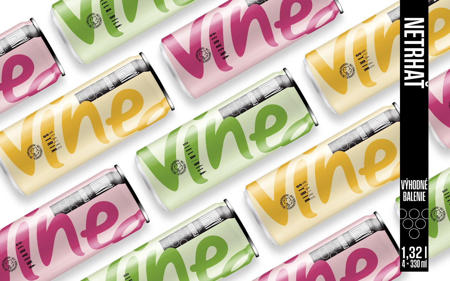
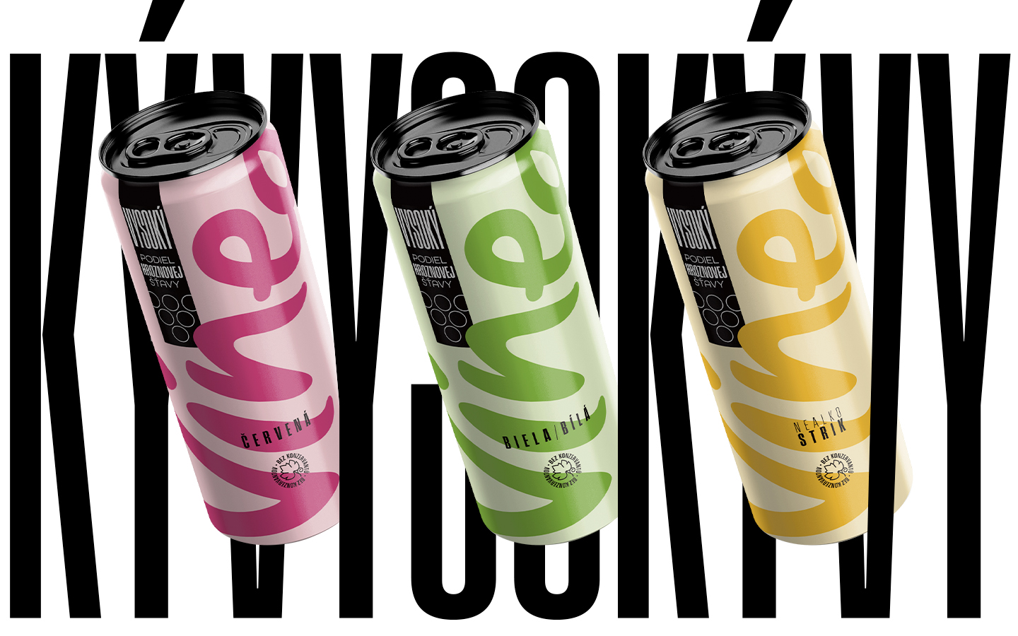
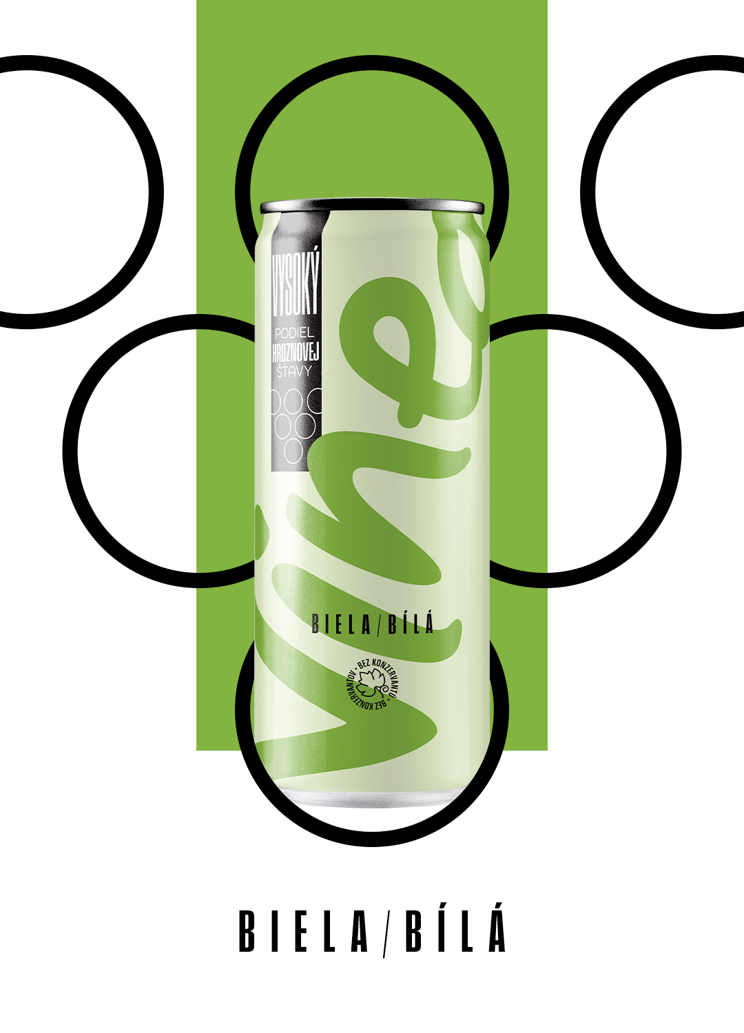
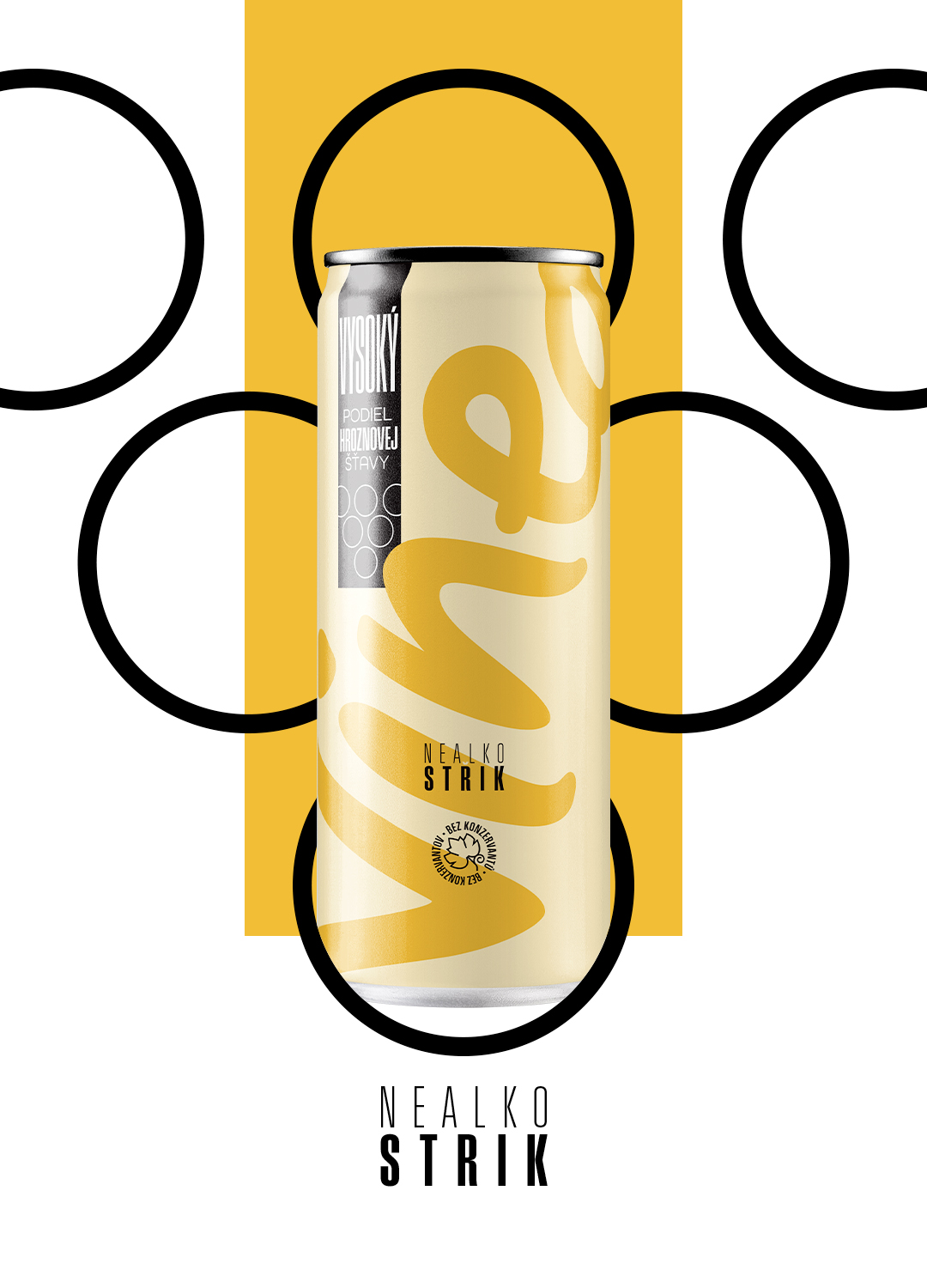
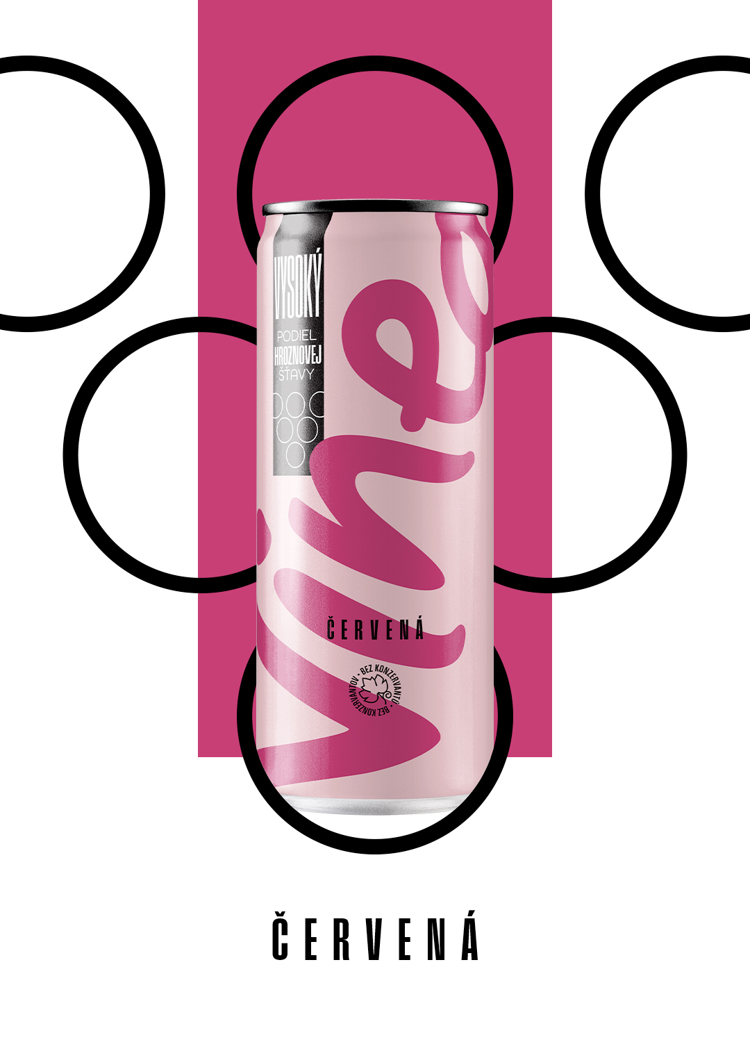
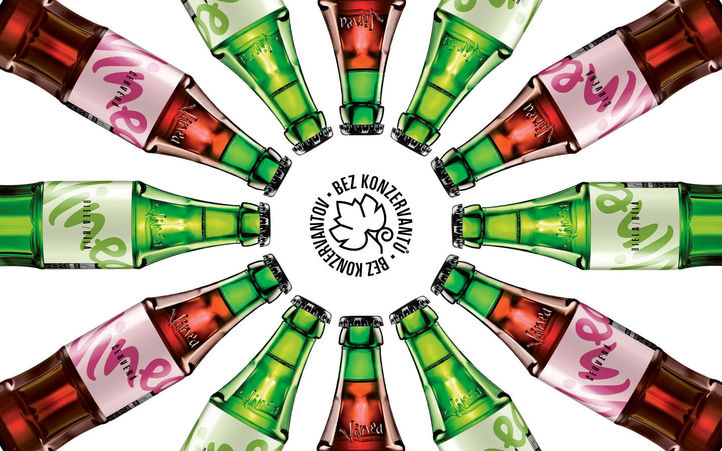
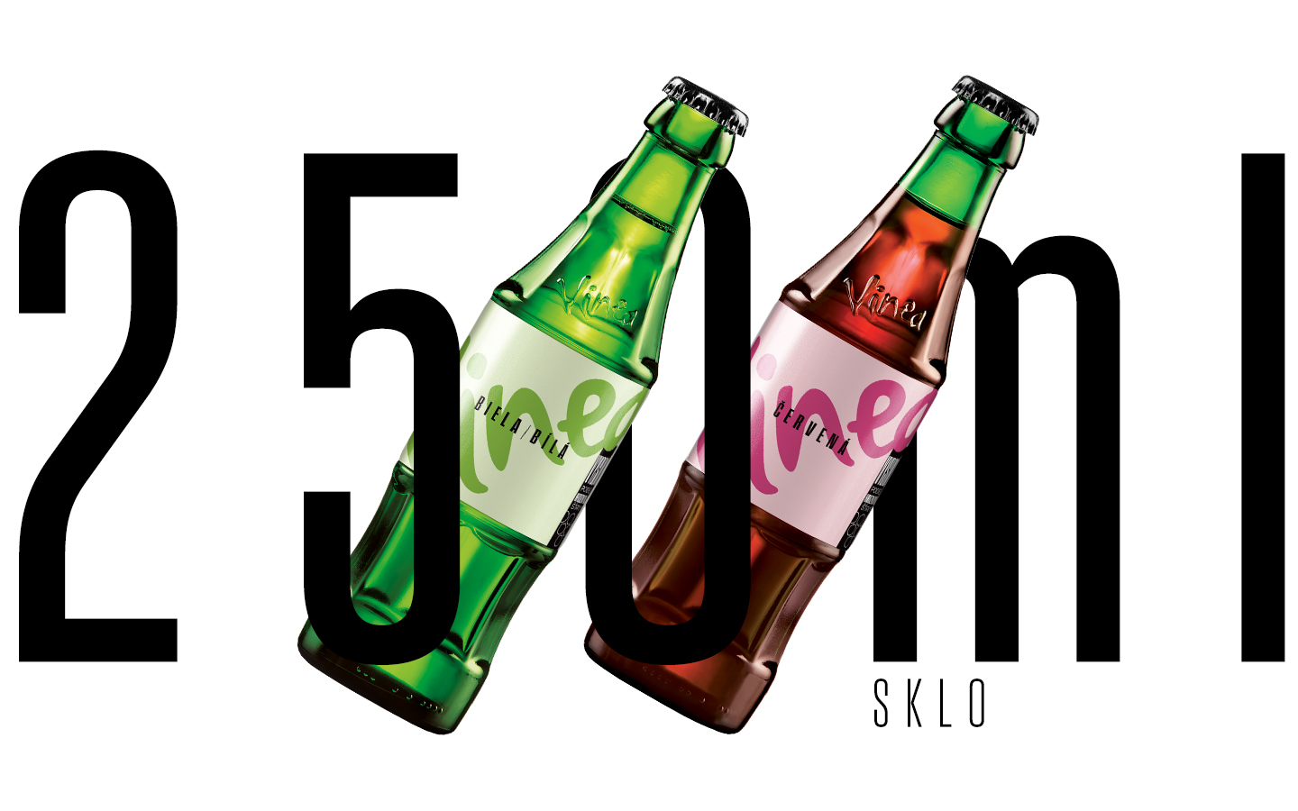
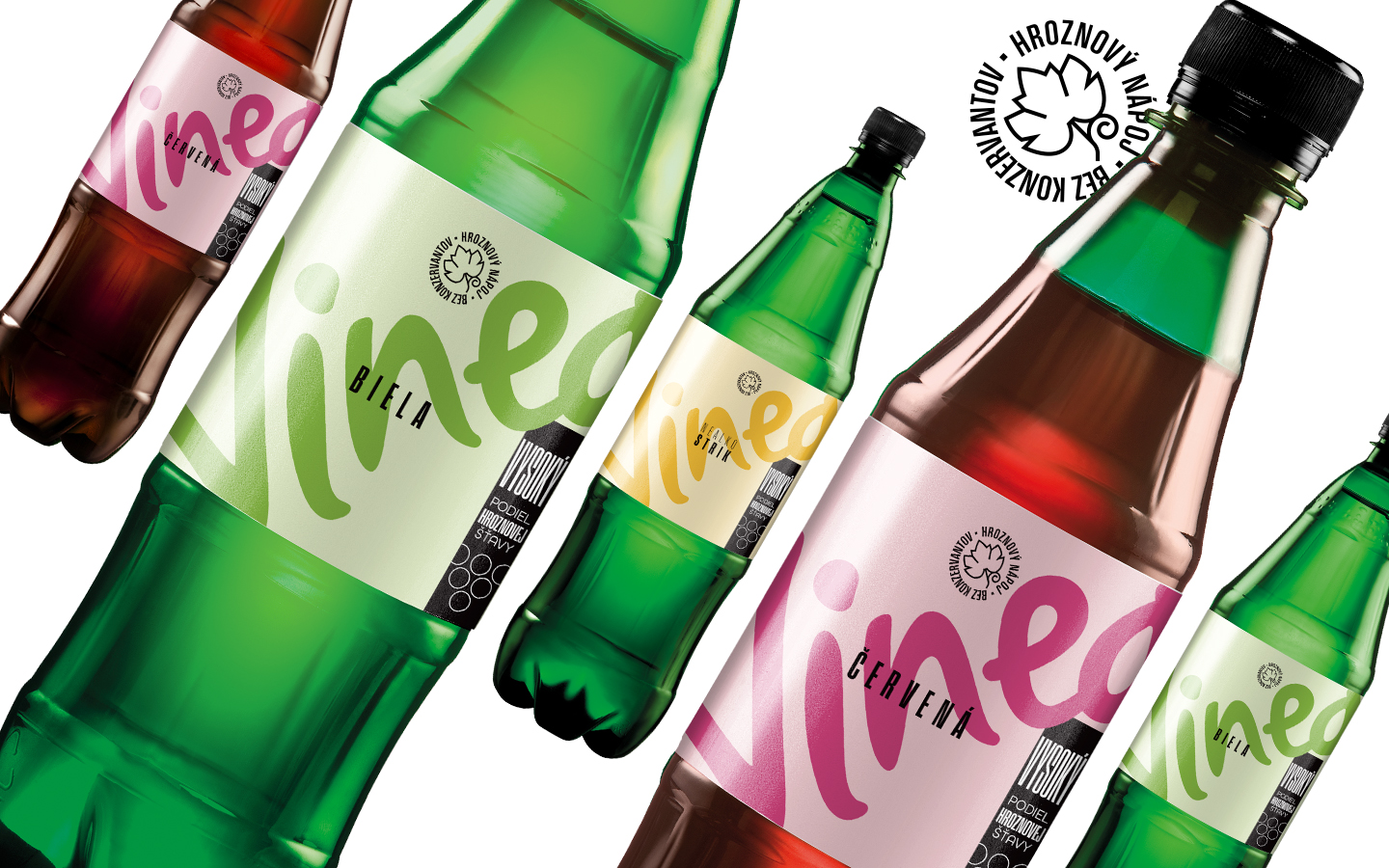
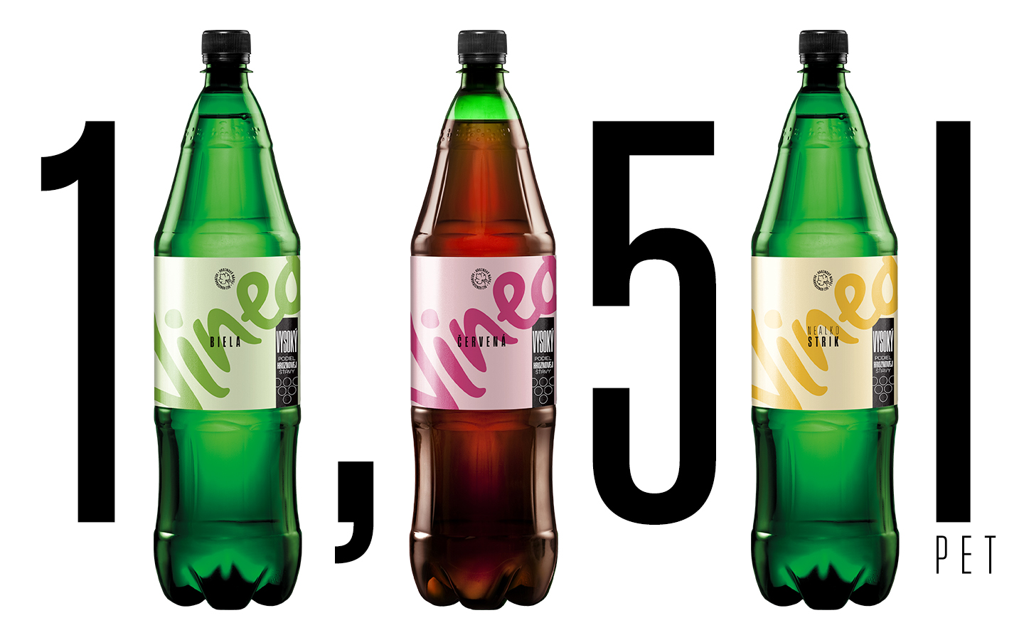
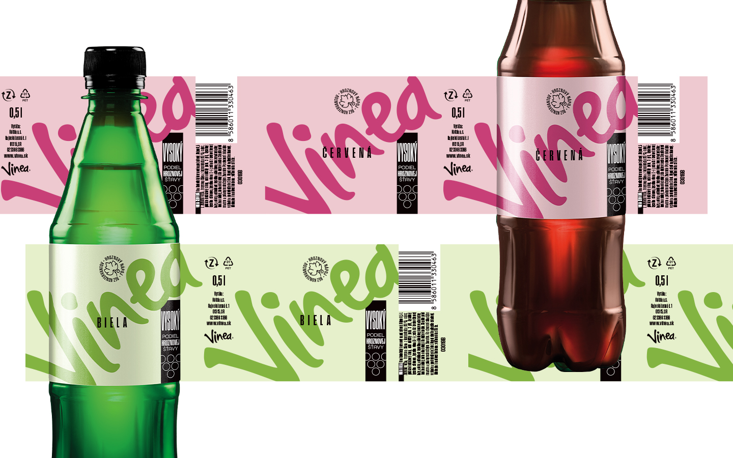
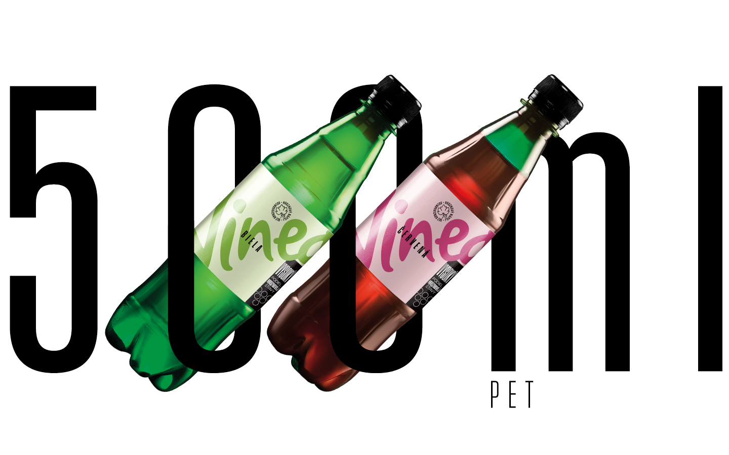
We have kept the visual language of the brand, but it has gone through a significant cleanup. The goal was not to lose the memory of regular customers and at the same time to reach a new, younger target group. A dominant logo exceeds the format and naturally attracts attention. Its color determines the flavor of the drink, and also thanks to the contrasting label, the entire product line looks significantly younger.

 Director
  f Taste
